TV Land Rebrand
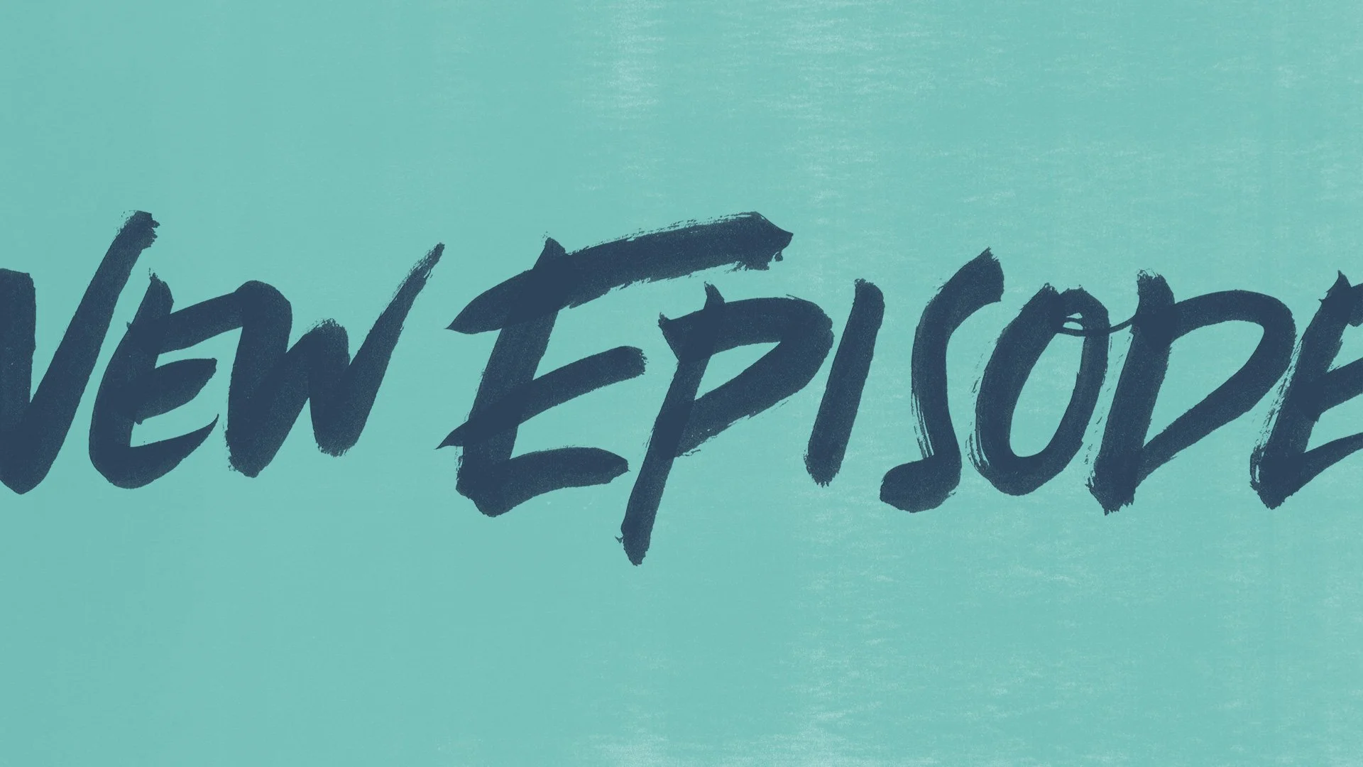
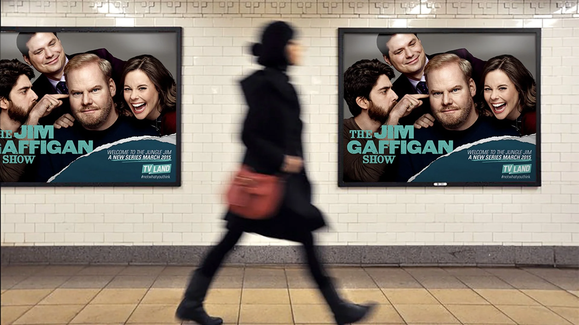
I was a part of the team at Roger to reimagine TV Land’s entire brand look from a fresh perspective. In looking for a brand typeface, we found that various brush fonts lacked authenticity and range. The solution: me writing out key words and drawing a variety of lines and shapes dozens of times in my handwriting using an ink brush pen. In the end, we were able to give the client a library of assets for any situation they might come up against.
studio: Roger
client: TV Land
role: designer, type design